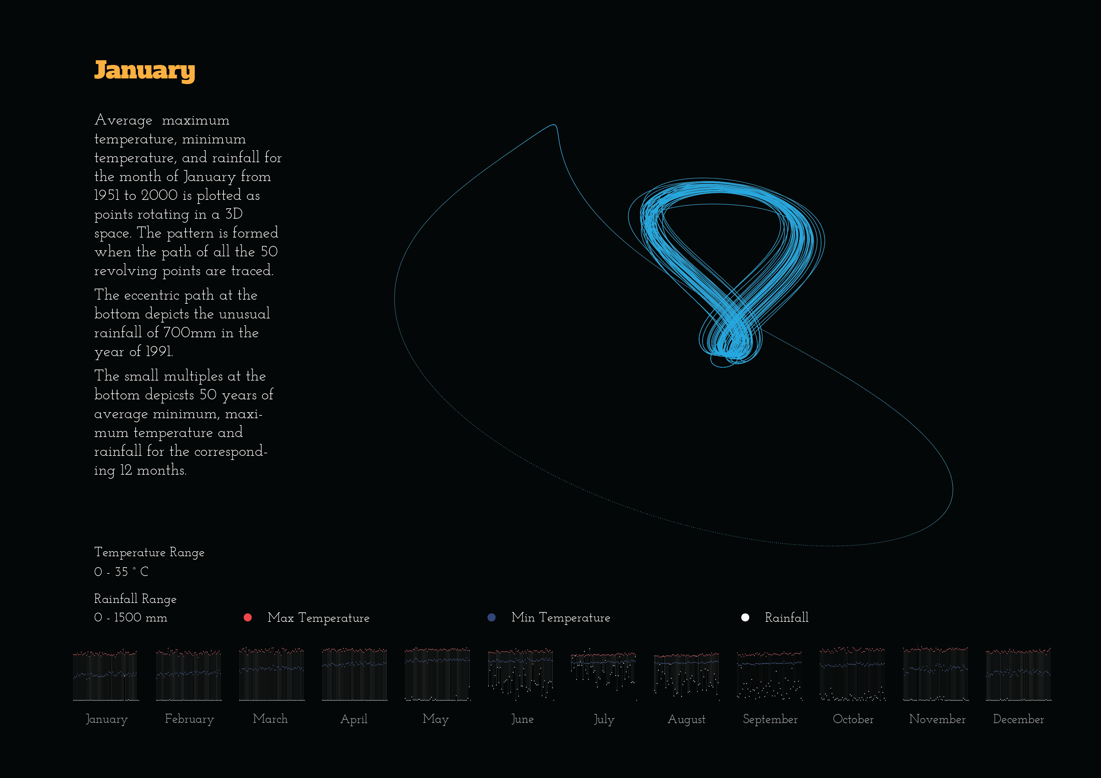
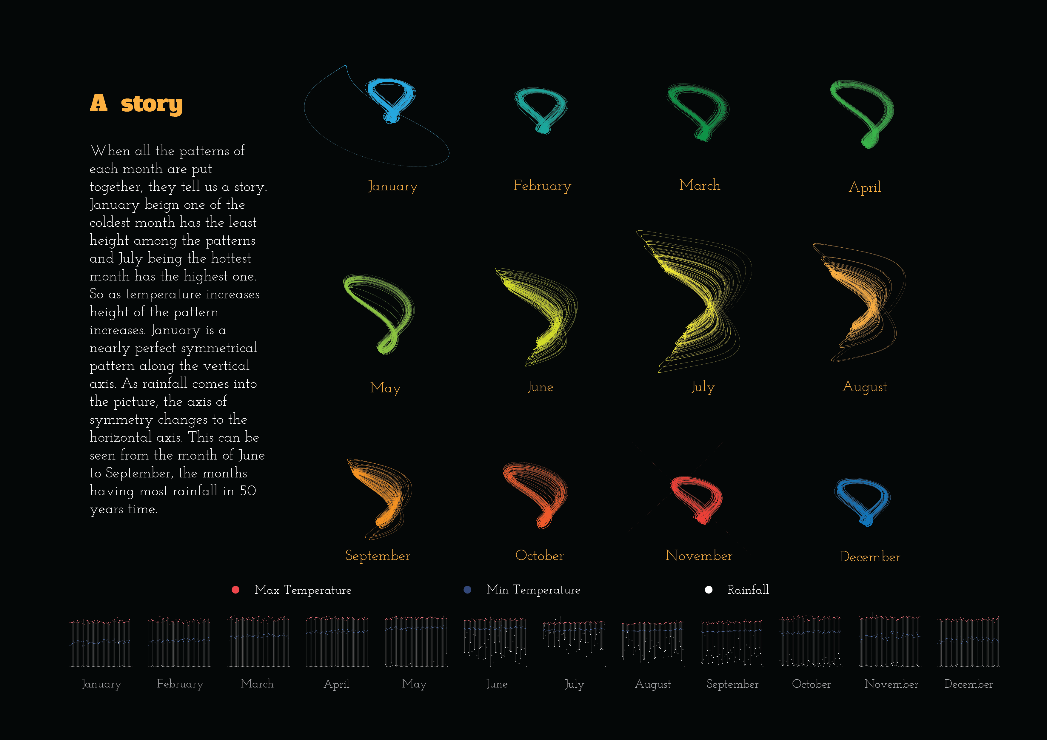
50 Years (1951-2000) of Mumbai Weather Data
When a large data set is presented in front of us, it does not make any sense to us until and unless we start doing number crunching. If the data is represented in some form of charts or diagrams than probably we can figure out something. Though the project “50 years of Mumbai weather“ is not about data visualization, but it deals with the notion of data art. The weather data is taken up and woven into a fabric of a narration that for each viewer would give an under- standing of its own. Each viewer could come to an altogether different conclusion of the diagrams shown in front of them and their conclusions be equally correct as the underlying principles of generating each diagram from the data set are kept exactly the same.
An attempt is made to generate such diagrams from the weather data of Mumbai for each month of the year. When someone would view all the diagrams together a form of a story would emerge out from the data embedded inside the diagrams.


-
Paulanthony George
-
Anulal VS